Tips for Styling a Console Table
A console table is a super versatile piece of furniture. It works great in an entry way, living room, or hallway and can be used for storage, a catch-all place for keys, etc, or a way to showcase your style through art and decor. I chose a great console table that I love and put together several different ways to style it along with some helpful tips.
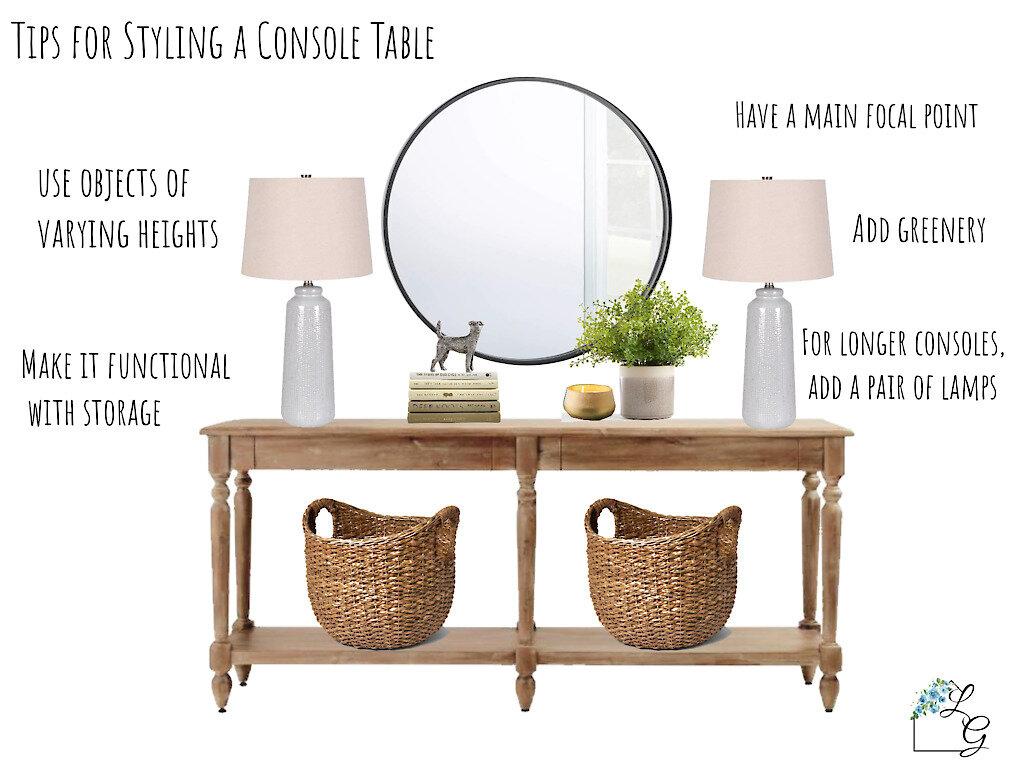
When styling a console table, it is helpful to start with a main focal point such as a mirror, artwork, or gallery wall. If you have more than one focal point, they will compete with each other and be overwhelming and confusing to look at.
For longer console tables, I love the symmetry of a pair of lamps. Make sure the remaining objects are varying heights to create nice flow. Try stacking a few hardcover books and placing a decorative object on top to get the height you want. When choosing a plant, I like to use ones that overlap the art or mirror to create layering.
Depending on the style of the console table, add baskets underneath for storage. They look great and are functional which is ALWAYS a win win! Perfect for blankets and throw pillows, but also cords, toys, and any other items you want hidden but accessible.
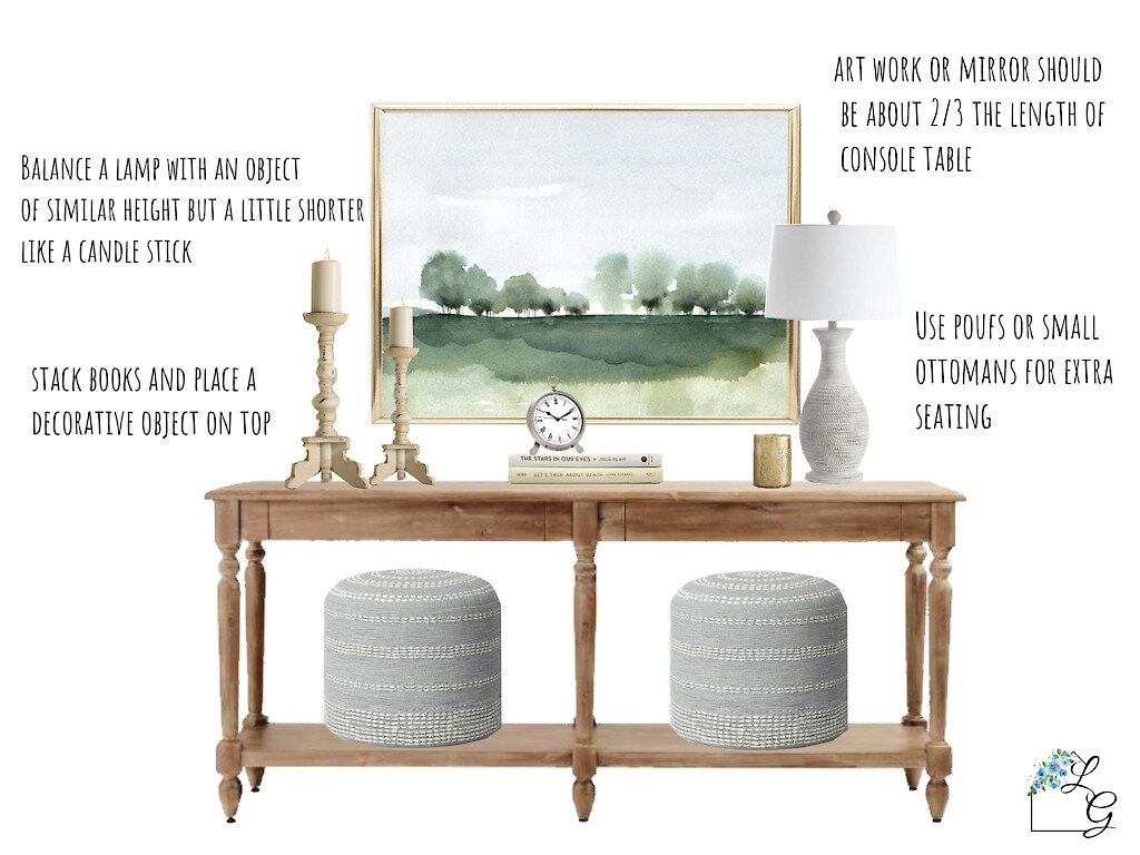
If you don’t want to use a pair of lamps or the console isn’t longer enough to do so, balance the height of the lamp with another tall object but make sure it isn’t quite as tall as the lamp. This balances the lamp but doesn’t compete with it. Decorative candle sticks or lanterns are great options.
When choosing art or a mirror for above, generally you want the length to be around 2/3 the length of the table. If you want to use a piece of art that is smaller than that, trying using a grouping to achieve the appropriate length.
Another option for underneath the console is poufs or small ottomans. If storage isn’t as much of a concern but seating is then this is a great solution.
A statement mirror is a great way to add dimension to a space especially in an entry way or hallway which tend to be smaller spaces.
When hanging artwork or a mirror, it should hit around 5-10 inches above the top of the console.
If you’re having trouble styling a console, when in doubt use symmetry. Symmetry gives a more polished and traditional feel and almost always works. I like to use a mix of symmetry and asymmetry for more interest and a slightly less traditional feel.
Another option is to layer artwork with a large statement piece and one to two smaller pieces. There should be some kind of common thread that ties them together such color, style, or theme.
Adding various textures gives interest and personality to the space. Bring in textures using woven baskets, textured artwork, and natural elements such as greenery, driftwood, coral, etc.
Throw pillows and blankets peaking out from baskets is also a way to add pattern and color. Use colors and patterns that compliment the art above.
If you aren’t decorating with a mirror, another way to add dimension is through metallic accents. This can be a lantern, clock, lamp finial, decorative bowl or object.
Check out below for a few more of my favorite AFFORDABLE console tables!
I hope these tips have helped you in styling a console table that you love! Don’t worry if it doesn’t look right the first time around. Sometimes it may take a little while to play around with different setups until you’re happy with the results.
Make sure to follow me in the LiketoKnowit app to shop these looks and others! Click the button below to check it out.


